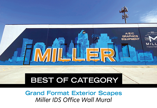
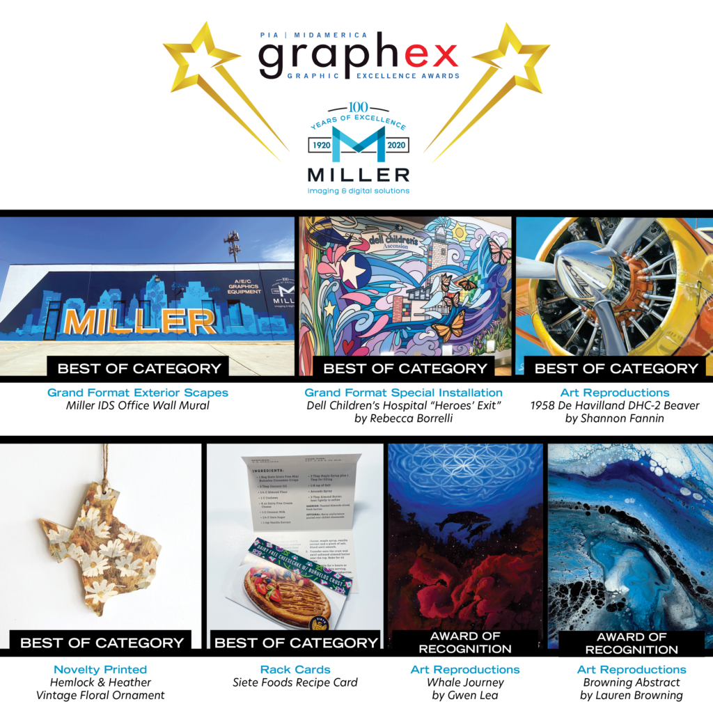
We submitted these seven pieces of work on behalf of our customers for judging in the Print Industry of America (PIA) MidAmerica’s “Graphic Excellence Awards” or GraphEx. Five won Best of Category and will move on to being judged at a National Level.
As you take pride in your work, we take pride in producing your work! We are proud of ourselves and of you for these beautiful pieces. Thank you to these amazing companies and individuals who trust us to produce a phenomenal product.
We will keep you updated on the National awards when they are announced.
For more information on our Graphic Printing services, please contact Elesha at CSSR7@MillerIDS.com.
Jessica grew up outside of Houston but is a Louisiana-native. She is a Texan with a deep love and nostalgia for Cajun life, like homemade gumbo and zydeco music. Jessica went to college at Texas Tech, and always knew Austin was where she would end up. She got a graphic design degree, moved to Austin, and worked for agencies as a designer.
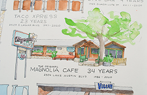
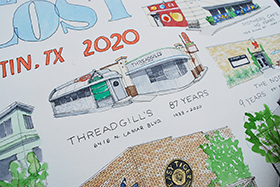
Jessica always made art on the side, as a way to explore her creativity away from the computer and clients. She began a drawing project in 2016 of drawing a building every day for a full year, 365 buildings. They were mostly of Austin and chronicled the changing landscape of the city as it gentrified through the 2010s. A fair amount of the drawings are buildings that have since been torn down and businesses that closed. This year-long project helped Jessica develop her style and led her to her career as an illustrator. “One of the big reasons I love drawing buildings and places is how it’s an anchor for our memories. We all hold stories of places from our past inside ourselves, and we all have different relationships to the same place. When I look at buildings, I wonder about who loves this place, who worked here for years, who met a partner or a friend here, etc.”
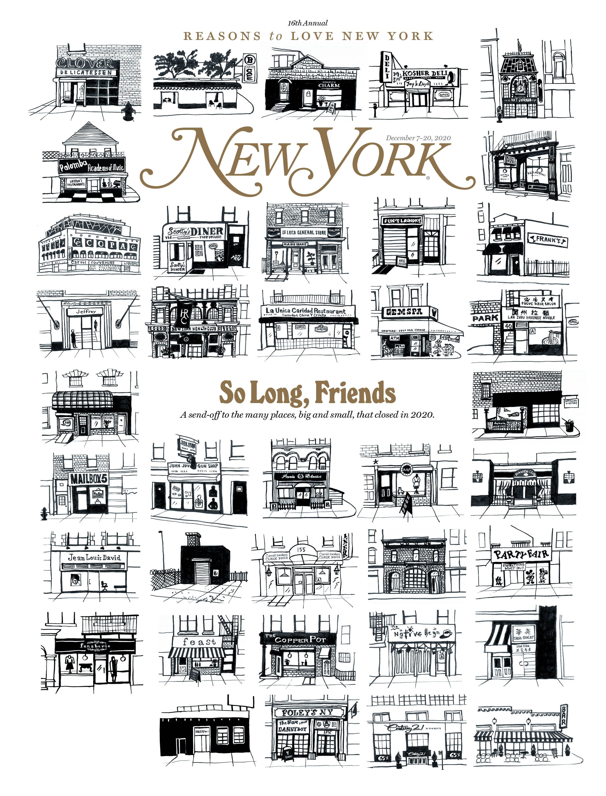
“When businesses here in Austin began closing soon after the pandemic started, I dreamt of making a piece dedicated to these places. But I was beaten down by the pandemic myself, so I let the idea go. Then as 2020 came to a close, I saw the New York Magazine cover dedicated to 500+ closed NYC businesses and a voice popped up, ‘Jessica, you are the person to do this for Austin. It is literally your job to make this. Do it.’ So, I relinquished and began.”
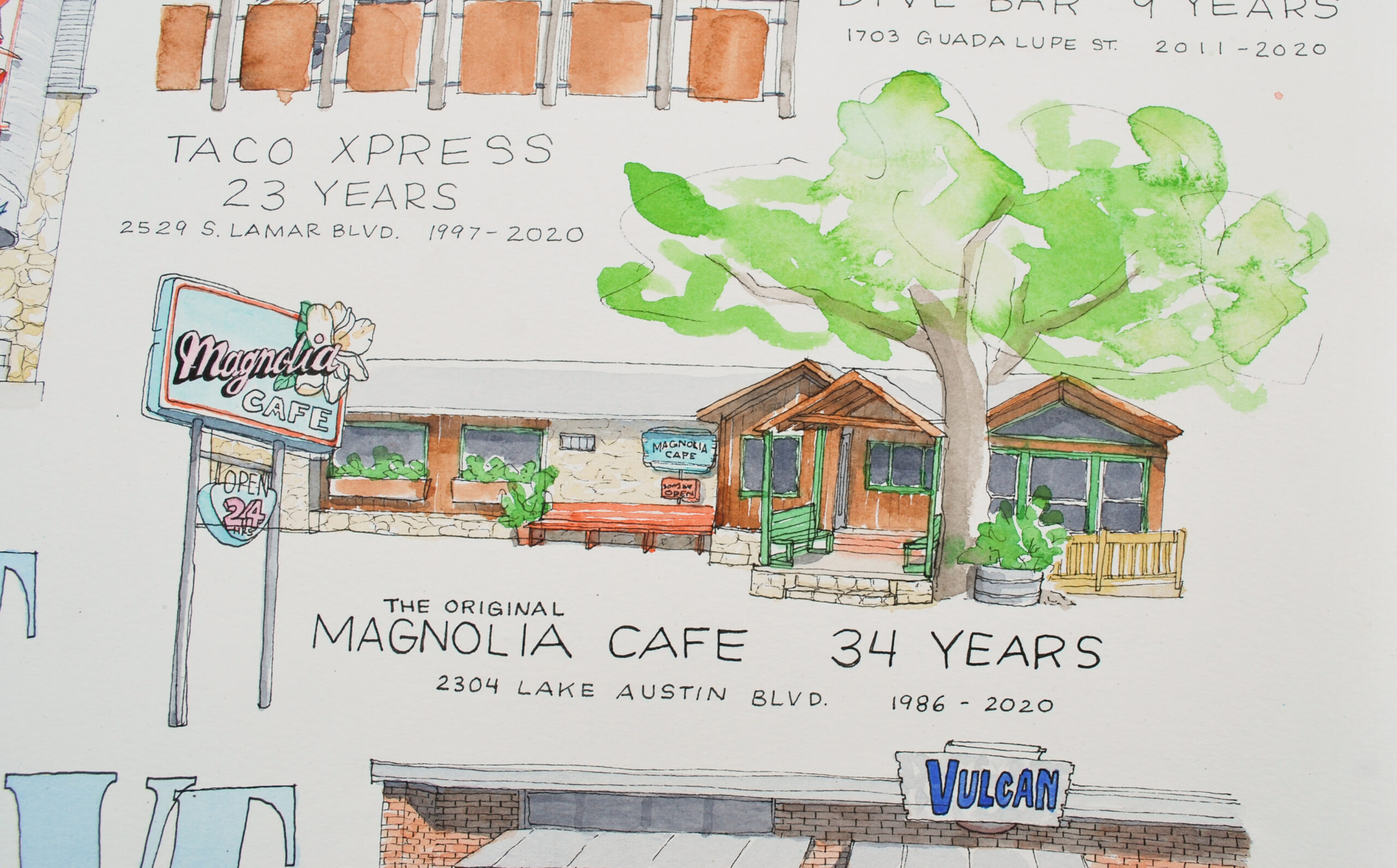
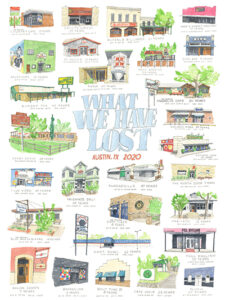
Jessica drew 28 businesses, for her “What We’ve Lost” series, ranging from the youngest of 5 years (Barracuda) to the oldest of 87 years (Threadgill’s). The original art is large at 28×40″, and she shrunk the work down to 18×24″ for the print edition. “I wanted to capture a slice of Austin’s history from the last few decades and memorialize some of the businesses that made Austin, Austin.”
“Miller was a delight to work with. Easy and helpful. I talked with Dana, who connected me to Jacy to complete the job. One of the memories of working with y’all that will always stick with me, is when I went to pick up my order, and the man who brought the posters out said, “You made everybody here cry real tears!” And we had a really nice conversation about the artwork and our changing city, with a lot of laughs and heart-warming smiles. Thank you, Miller!”
We can now print promotional items such as pens, coffee mugs, face masks, and more!
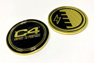
We are always looking for unique jobs we have done to share with our customers, and this is definitely one of those. This really unique opportunity presented itself when sports nutrition company, Nutrabolt (C4), reached out to us to produce challenge coins to grow their military presence.
Traditionally, a challenge coin is a small coin or specially cut medallion, with an organization’s insignia or emblem pressed or embossed into it. The challenge coin is carried by the organization’s members, or put on display. They can also be collected by service members and law enforcement personnel. Historically, challenge coins were presented by unit commanders in recognition of special achievement by a member of the unit.
Nutrabolt wanted a way to create brand awareness and brand recognition on military bases, and decided to lean into military traditions in order to do so in a special and memorable way.
Nutrabolt is getting ready to roll out their C4 yellow cans in the military through their beverage distributors. The idea of creating a challenge coin came from one of their distributors who covers several military bases. They plan to present the coins to distributor sales teams covering the bases, as well as store management on-base. The challenge coins will be used for displays, incremental placements, and as a tool for brand recognition that falls in-line with military customs.
We love getting to work on special projects like this one, and really appreciate when customers come to us with creative ideas we get to help bring to reality!
Sarah Wilson is an Austin-raised photographer and cinematographer. Her passion for photography and storytelling was born here, at Austin High. Sarah pursued a classical photography education at NYU’s Tisch School and remained in New York City throughout her twenties. She started as an intern and assistant for some of her photography heroes, including Mary Ellen Mark, Ken Schles, Robert Clark, and James Evans before creating her own body of work.
Since 2000, Sarah has worked professionally, balancing personal projects, documentary films and editorial assignments. She has worked for The New York Times Magazine, Time, The Atlantic, Mother Jones, Texas Monthly, and others. Her work has been acquired by the Harry Ransom Center and the Museum of Fine Arts Houston. Sarah is also teaching Expressive Photography at ACC’s Department of Professional Photography, encouraging students to pursue personal projects, alongside their commercial work.
As a documentary filmmaker Sarah has served as Director of Photography and Producer, working alongside her husband, Director Keith Maitland, on the films, TOWER, an animated retelling of the 1966 UT Tower shooting, and A SONG FOR YOU: The Austin City Limits Story. Both films premiered at SXSW in 2016. TOWER received three SXSW awards, a Critics Choice Award, and the Emmy for Best Historical Documentary. Their newest documentary, DEAR MR. BRODY, was set to premiere at the Tribeca Film Festival and the Telluride Film Festival—but both were cancelled due to COVID-19. Sarah said, “We are excited that the film was featured at the SXSW virtual film festival last week.”
“I like to photograph people- I love telling stories…but I also like to be in the lonely West Texas desert, photographing in the stark landscape.”
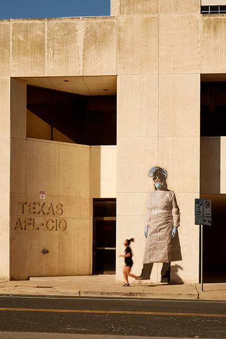
Essentials Q&A
What pulled you to honor and highlight these women essential workers?
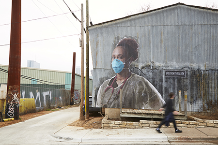
As the pandemic set in and our community was asked to shelter in place, I quarantined with my immediate family. As a photographer, my work was not deemed essential, but something about the word ‘essential’ really spoke to me. I became especially grateful for the workers that were keeping our community safe and moving forward. I started to think about the women workers, many of whom were juggling responsibilities at home, while facing this public health crisis due to their ‘essential’ work. Inspired by these women, I felt an overwhelming need to recognize their courage, so I started taking portraits of essential women workers in Austin, on location, outside, at their workplace. As the body of work started to expand, I decided to submit the work to the City of Austin Museums and Cultural Programs grant, called ArtsResponders: Social Practice Responds to COVID-19. I was excited that the project was selected, but that was just the beginning.
How did you find these specific women to photograph?
In partnership with the Dougherty Arts Center and ArtsResponders, we put out a call for entries for people in the Austin area to nominate the essential women workers in their lives. We chose 15 honorees to photograph out of over 100 nominations, and instead of having an indoor gallery show, we decided to present the work as large-scale wheat-pasted portraits on the sides of participating buildings throughout Austin.
Any plans to do another project in this same style?
I think I caught the wheat paste bug! Now I feel like everything has to be big and public!
How did you decide on wheat paste?
With the ArtsResponders grant, I needed to keep my budget low, while at the same time creating a public art exhibition. Weatherproof photographic materials can be very expensive to print, and just as expensive to install. While brainstorming presentation solutions with Annie, my rep at the Dougherty Arts Center, we came up with the idea of wheat-pasted portraits. I was definitely inspired by the artist JR, and his large-scale wheat paste installations. I decided we needed some large-scale portraits of women workers here in Austin!
What has the feedback been like on the photographs?
We’ve had a very positive response to the work, through the local news media, on Instagram, and word of mouth. Yesterday on Instagram, I saw that a nurse had taken a photo of herself next to the large-scale portrait of an ICU nurse. In the comments, she said that seeing these 19ft tall portraits made her feel that her hard work on the frontline was also being recognized. This is what I intended- that each of these portraits would come to represent the thousands of women in our community who have worked so hard to keep our community safe and moving forward. This project is a big thank you!
How did you choose Miller to print the photos?
I chose Miller because I’ve been a customer on and off over the years, and the location was very convenient for me. I did some research and found out that Miller could print 36” x 48” on a lighter weight paper, which works well for wheat paste. After the first round of test prints, I learned that Miller has very quick turnaround times, and has a super-friendly staff. It’s a treat when Larry brings my order out to the parking lot…what a nice guy!
Anything else you want to add?
Another exciting aspect of the project is the Instagram site, @essentialsatx. We not only feature photos of the large-scale portrait installations, but we also post the images and stories of all the nominees even those that weren’t selected. It’s starting to become a great online community and a way to honor these awesome women.
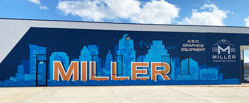
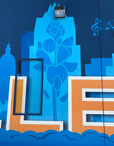
Like many other businesses, we are conducting business through curbside service and delivery. We wanted to bring advertising outside where our customers are — plus show off our graphics printing and installation capabilities.
We decided to update the exterior of our Metric store location with a custom mural printed in-house on our HP 1500 latex printer. We used Drytac anti-graffiti lamination to make our mural durable and easy to clean. To prep the wall and give our mural the best chance at adhering long-term, we first had to power wash it. We opted for a fresh coat of paint so that the colors would pop. The final prep was to let the paint “gas out” for 2 weeks.
We wanted to thank the sponsors of our mural for their support in our Metric makeover. Thank you to Alonzo Suarez of ASM Painting for power washing our wall to get it prepped for the entire process, Clements Paint for supplying our new coat of paint, Tom Page for installation services, and our very own Vittoria Mottler for the incredible design!
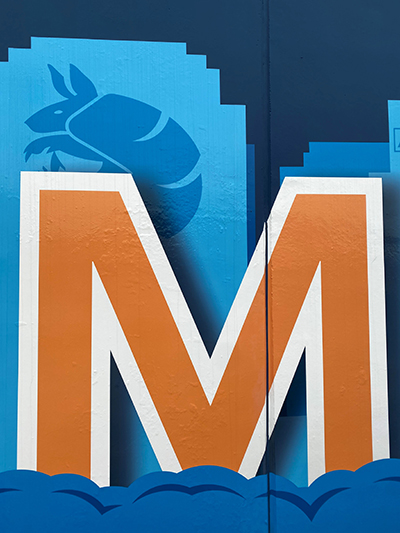
The majority of the mural was all hand cut by our graphics production team, and the music note details and logo were cut by our iEcho router. Considering the face of our building endures some pretty heavy sun exposure, we don’t anticipate seeing any quality changes for the first 6 months. After 6 months, we may start to see some minor fading, but the mural itself, under normal weathering circumstances, will remain intact. The adhesive on the vinyl melts into the textured surface of the concrete, so there shouldn’t be any lifting happening (under normal weathering circumstances) for at least a couple years.
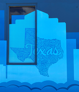
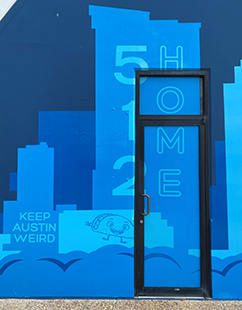
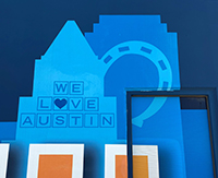
As far as the design goes, we wanted to include the ever-growing Austin skyline with the silhouettes of recognizable buildings across the entire background of the mural. We featured a lot of iconic Austin imagery, because Miller is an iconic staple in the Austin print community. The graphic elements are all representative of Austin and Texas as a whole, which we think all Austinites and Texans can appreciate. The blue color scheme comes from our logo, and a pop of new color represents another aspect of Miller growing and expanding, especially in the Graphics Department.
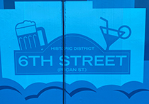
We featured 6th Street, not only because it is famous in Austin, but also as a nod to our long-standing time on 6th Street before relocating to East 7th. We included the quintessential phrase, “Keep Austin Weird” accompanied by a dancing taco, because us Austinites love our tacos. We paid tribute to our home of 100 years with “512 Home” written down the door, and “We Love Austin” further down the wall paired with a horseshoe — because all Texans ride horses. Being in the Live Music Capital of the World, we had to include some music notes dancing across the skyline. We hope that those who drive by our building find some joy from our mural and may be inspired to change up their space with our help.
We had so much fun coming up with all the design aspects, prepping the space as a team, and sharing it with our community! If you want to add a fun graphic element to your building, space, office, even home, reach out to our graphics team; they would love to help!
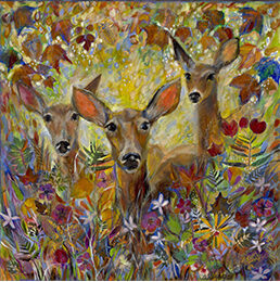
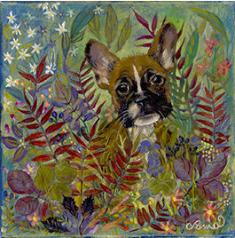
Anna Lisa was born in Laredo on the border of Texas and Mexico. There, her father planted many fruit trees including tangerine, orange, lime, peach and fig. She spent many days playing under and in the tangerine trees in her backyard. She spent hours drawing in the shade of the trees where her mother set her up with a large pad on a bench and Anna Lisa on a small chair. Anna Lisa says she’s been a creative as long as she can remember — whether it was drawing, dancing or creating in other ways. She continued to draw through her high school and college years, recreating images from magazines and doing portraits on request. Anna Lisa left Laredo at the age of 16 and moved to central Texas where she attended college at Texas State University in San Marcos.
Over time, her love of visual art was set aside for more “practical” studies and ultimately a corporate career. In 2008, as part of her personal renewal, she returned to the garden to draw. Anna Lisa said, “Although I lost my sense of time while I drew, I found myself and inner harmony through art. I felt like a child again. I was experiencing the world with new eyes”, and she hasn’t stopped creating since.
She loves to work with pastels because “the colors are unparalleled – pigments at their purest!” She also calls pastels her adult crayons and has explored the medium voraciously from the moment she picked them up. Upon moving to her current property, she spent the first few years creating art through landscaping. When there was no more room for real gardens, her gardens and its inhabitants began to extend into her artwork.
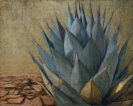
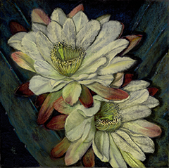
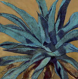
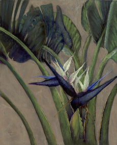
Anna Lisa’s artwork embodies the patterns of nature, particularly botanicals. She is driven to create paintings which reflect nature’s captivating beauty, and it is her artistic mission to transport nature’s beautiful design to indoor living spaces. As a lifetime Texan, the various floral and animal inhabitants of the Southwest, specifically Big Bend, New Mexico and Arizona are frequent subjects of her work, as well as the Sonoran and Chihuahua deserts.
“My heart is with the agave. I am moved by the stateliness of the agave and the seemingly endless variations in size, colors and shapes. I enjoy the colorful and dangerous beauty of cactus, the undulation of the agave leaf imprinted by the now unfurled leaf, and the poignant swan song beauty of the agave flower. But, I am also enamored with tropical flowers particularly those in Hawaii and Costa Rica.”
After graduating from University of Texas at Arlington with an art degree, Pama worked as a graphic designer then creative director for 25 years. After that, she worked for 8 years painting portraits and murals full time. Pama was able to make a very good living being a professional artist.
During that time, she taught adults and children at the art center in her town. She also took ceramics, life drawing and glass fusing classes. Every year she does many commissions of pets and people as well as special memories from clients’ photos.
Pama moved to the Austin area (Point Venture) from Dallas 10 years ago and loves it. Since moving here, she has made several bronzes, lots of jewelry and numerous mobiles. She still makes fused glass and has started incorporating fused pieces in her paintings.
“I come from a long line of strong, creative women who have always inspired me. Creativity was a part of their lives and so it has become a part of mine. We always encouraged our children to explore their creativity. Two of them are art teachers in AISD and one is an actor.” It is important to Pama to always be experimenting with many kinds of art, as it helps keep the creative juices flowing.
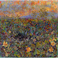
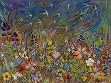
Although Pama loves painting, her passion is gardening. She started pressing petals, leaves, feathers and insect wings onto her canvas with paint about 3 years ago. She says she is “gardening” and painting at the same time. “It is very interesting how the petals and leaves change color when dried and pressed. I love to bring them back to life with paint.”
This website uses cookies to improve your experience. We'll assume you're ok with this, but you can opt-out if you wish.AcceptRead More
Privacy & Cookies Policy
Privacy Overview
This website uses cookies to improve your experience while you navigate through the website. Out of these, the cookies that are categorized as necessary are stored on your browser as they are essential for the working of basic functionalities of the website. We also use third-party cookies that help us analyze and understand how you use this website. These cookies will be stored in your browser only with your consent. You also have the option to opt-out of these cookies. But opting out of some of these cookies may affect your browsing experience.
Necessary cookies are absolutely essential for the website to function properly. This category only includes cookies that ensures basic functionalities and security features of the website. These cookies do not store any personal information.
Any cookies that may not be particularly necessary for the website to function and is used specifically to collect user personal data via analytics, ads, other embedded contents are termed as non-necessary cookies. It is mandatory to procure user consent prior to running these cookies on your website.


